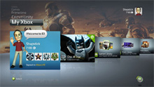
 So apparently, if you filled out an application for the NXE a few weeks back, you can already get online and grab your update for the XBox 360. I turned on my 360 earlier tonight and was pleasantly surprised to be greeted with a new update, which then promptly replaced the old dashboard with the slick shiny new one.
All in all, while I like the way they’ve re-organized things, it all just seems overwhelmingly unnecessary, though I understand that something had to be done about all the clutter with the marketplace and the usability in general. I like the sleek look of it, and I can’t wait to test out the party system, which will let me bring several friends into games at once and do private chats with groups of people.
While some features are a little harder to find, I think one of the really cool things about the update is the ability to browse your achievements in a really easy-to-navigate way, with all of them laid out in blades and tables. It’s pretty easy to browse, which I guess was the end goal, though I think some people are going to hate it.
So, once you get your copy (if you applied go online and get it, the rest of you have to wait another day), let us know your thoughts!

Hmmm, browse your achievement? I’ll stay away from that. I like finding achievements the old fashion way.
It’s amusing to me how much I have missed out on since letting my Gold lapse back in March. I can’t wait to get back on and see the new changes. I’m not sold on the avatar idea, but there has to be some sort of ingenuity if Rare is involved. That being said, I want to see how they differ from Nintendo’s Mii’s and how the avatars are worked into new and existing games. I’m excited about the Netflix streaming. I also hope that the new interface makes all of the cool stuff I’ve missed this year easier to find.
OMFG EDDY I CAN CRY!!! YOU JUST TOLD ME MS FIXED IT!!
GROUP CHAT NOW EXISTS BLESS YOU IDIOT MS WORKERS!!! That has really been a problem, who the hell makes a chat pro gram with like 5 channels and only 1-1 chat abilities. SERIOUSLY!?!?!
It looks stupid to me though but I wont complain. Like you said, UNNECESSARY. Ill let you know my final word. Though I think I already know, Im going to like it a lot, but hate all the ads 🙁
Hey, what do themes look like?!?!?!
Yeah, I’m not seeing the point of the avatars at all except they think its part of what made Nintendo so successful, but you can ignore it if you want. I’m actually shocked there aren’t more options.
Hey Eddy, have you figured out how, or if its possible, to change the background behind you when your friends now look at you. Some have guitars, some have rocket ships.
Like you said most of it is useless crap…and yea, there needed to be more options. Basically they just threw all their adds at you first.
Im REALLY mad that the first page/tab/whatever you see is NOT your game/tag/settings thing…thats pretty F’d up. They are just throwing ads at us..Lame.
My avy looks like me…I…I dont look like a hippie that much do I????