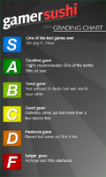
 A month back or so, we asked for your input on how our grading scale worked for the games we review here at GamerSushi. You all weighted in with you thoughts, and gave some really valuable input that helped us in our discussions about how we should address our grading system going forward. Seriously, it really pointed us in the right direction. So, it is with great pleasure that we introduce to you the brand new version of the grade chart.
We’ve created a new page that has a breakdown (written by Anthony) of how the updated grading scale works. We basically combined several ideas that people gave us.
Our problem before was that since we are a small site with limited resources beyond our own wits (and even that isn’t much), there’s no way we’re going to be reviewing games that are truly worthy of D’s or F’s. Even C’s for that matter. All of our scores ended up being in the same zone for this reason, because half of our scale was useless.
What we’ve done now is address that issue by re-scaling the chart so that it basically only takes into account the hyped or AAA titles. That means that even a D could still be a good game, just a blockbuster title we didn’t enjoy as much as others. On top of all that, we ditched the +/- system, and added a new grade of “S” for the truly special games. This took care of the issues we were having where a game like Resident Evil 5 deserved an A+, but on our old scale, that would mean it was one of the “greatest games of all time”, along with Uncharted 2. In our new scale, RE5 becomes an A and Uncharted 2 becomes an S.
Anywho, Anthony explains all of that much better on the new grade chart page. I’d suggest checking it out and leaving your thoughts here! We’ll be re-scoring all of our reviews over the next weekend, so tell us your thoughts on those, too.
EDIT: Nick made the sweet graphic of the grade chart. He yelled at me for not telling you guys that. Whoops. NICK MADE IT.

Love the new rating system, in taking a graphics design class the one thing I hear over and over again is that the best designs take something complex and tone it down to something a lot more simple and I think you guys have done this very well with your rating system. not only is it easier for us, the readers/community, to better understand your thoughts on the game. It also looks like it will be easier to choose how to grade the game using this new system.
“Anthony explains all of that much better on the new grade chart page. I’d suggest checking it out and leaving your thoughts here!”
You can’t leave comments on Anthony’s new, Well crafted, grade chart page because the comments are turned off.
@Gadfly Jim – thats why they said to leave comments here =).
I really like this new system. Sometimes simple is better, and this demonstrates that for sure. Can’t wait for you guys to review AC2. Just saw the “Reviews On The Run” which I usually find I agree with, and it recieved a 10 from both gentlemen. Gotta wait for PC though… =/
[quote comment=”9350″]@Gadfly Jim – thats why they said to leave comments here =).[/quote]
Oops, I must have read it as there instead of here 😛
I’m lovin’ the new scale. It’s the first rating scale that compiled all the shit into one letter: F. Kudos to your revolutionaryism.
I really like the new grading system simplicity for the win. but It seems to me that b and c are very similar in the descriptions